How to Improve Your Advertising With Split-Testing
Transcript
Today, we're going to be talking about how to improve your marketing with split testing. My name is Leah Mazur and I'm a Facebook and Instagram advertiser. I've been working in digital marketing for the past 10 years and specifically doing just Facebook and Instagram ads for the past five years.
I have my own company, I consult with a variety of different clients in different industries, helping them with their Facebook ads. Split testing is also known as conversion rate optimization or A/B testing and essentially what people are talking about is typically running a split test on a landing page. So you create two versions of a landing page.
You've got version A and version B, and they're usually slightly different and you split your traffic between the two pages and then you look at the data and see which one performs better. So if you have a thousand users coming, you might send 500 to version A, 500 to version B and see which page gets more sales.
And in this way, you can optimize your advertising to learn more and more about how, what your customers respond best to so that you can improve and get better. However a limitation, especially for startups when you're just starting out is that you need a lot of data to run tests, that is, a lot of users.
So if you've only got a few hundred people coming to your website every month, you're not going to have enough data to split them up between the two variations and actually get enough conversions to be able to get any significant learnings about which one performs. So in this presentation, I'm going to be talking about four ways to set your tests up for success so that you can really maximize the results of your split tests and get the most data out of them.
And number two, the most important factor that you need to focus on when testing. So let's go into the four factors to set your test up for success.
Number one is speed. Number two is clarity. Number three is relevance, and number four is consistency.
So number one is speed. Slow load times will cost you traffic.
So on this next side, I have a screenshot from Facebook ads and you can see that we've gotten almost 10,000 link clicks, but there were only about 7,600 people who fully loaded the landing page, which is what landing page views means. So there was about 2000 people that dropped off from here to here.
And often the biggest reason for that drop off is the page taking too long to load. So if you're paying for 10,000 users to go to your website, but you're losing 2000 of them just in, because of the page speed, you're significantly reducing the amount of users that are going to be participating in your split.
So this is a screenshot from page speed insights, which is a free tool from Google. You can put your website in here and it will give you data on how your page performs in terms of speed. And it'll give you recommendations for how to improve that. So that is one tool that you can use to make sure that your speed is as fast as possible and your landing pages loading really quickly.
Number two is clarity. You want to make sure that your message and your ad copy is really simple and you want to make it really obvious what the next step is for them. So this is a screenshot from Honey. Honey is a Google Chrome extension that you can install that will basically search the internet for the best prices for you.
So as you're shopping, they scour the internet for coupon codes and they find them for you. And then you have coupon codes to use when you're shopping. So they do a really good job of making their message super simple and super clear on their homepage. And it's also very obvious what's the action they want you to take here.
There's only one thing to do other than login. But they even removed their navigation. The only thing you can do on this page is just added to Chrome and install the extension. So it's really clear, really obvious what they do and what the next step is.
Number three is relevance.
So you want to try to appeal to a specific benefit or outcome. So that last page with honey was their website homepage. So it's a bit more broad, but this is an example of one of the landing pages that they're using from their ads and this landing page talks about how It can save you money specifically on Nike.
And they've got the picture there specifically for Nike, and they basically have kind of designed the landing page to look like a blog post, and it shows you how you can save money on Nike specifically. So what they've done is they've gotten more specific with their messaging and gotten more specific in how it benefits the audience.
And this is something that's really important to test out in your messaging because often if you're too broad, people won't make the connection in their minds from A to B to C to what it does, to how it can help them specifically. So remember that your user is on the internet. There's a million other distractions, other things they can be doing.
So you want to be as specific as possible about how you, what your offering, how, how your offering can benefit them so that they can make that connection in their mind right away. Instead of being really broad and vague.
So a way that I like to explain this is showing an example from Lego. So Lego sells a lot of kits.
They package their product up in kits, they do also sell like just the big box of bricks, but the kits are what I would imagine that they make most of their money on. And you can imagine if you're a parent in a store and your child really loves star wars, and you saw a kit specifically about building a star wars ship.
It's going to feel a lot more relevant and it's going to feel, it's just going to be a better sell, an easier sell if you show them what the specific benefit is. So for Lego, they've got all these bricks and you can build anything you want, but with the kids, they're getting even more specific to what the outcome is.
It's you can build a pirate ship or a tractor or a dinosaur or whatever. So think about the ways that you can take what you offer and break it down into a really specific benefit that your audience gets from it.
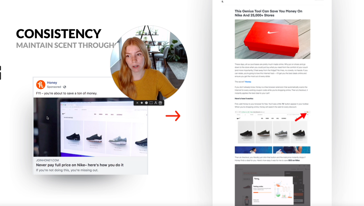
Number four is consistency. So you want to maintain scent throughout the journey. So scent is basically making sure that when they click on from the ad to the landing page, to the checkout, the customer is feeling like the experience is really consistent and everything kind of matches up for their expectations. So for the landing page about saving money on Nike, the ad that comes before it is this one, never pay full price on Nike.
There's a picture of the Nike shoes. And then you go to the landing page, right? The headline is about Nike. It's all about Nike and they've got the screenshot of the shoes here again. So you're really not surprised when you click from this ad to this landing page, it feels consistent. It feels safe for the customer.
Feels like, yes, this is what I expected. This is what I wanted.
If this ad was to take them to somewhere totally different, they might feel confused and confusion almost always leads to leaving. In which case you're not getting as much data for your tests and you're going to lose people that you probably paid to get from advertising.
So making sure that this experience is really consistent for them is, um, is really important.
Here's one more example from Fabletics. For Fabletics they have an ad for a deal two leggings for $24. And when you click on the ad, you immediately go to a landing page that is about two for $24 leggings.
So what the mistake that some people make here is they might have a promotion and send people to their homepage, or maybe just like the leggings page on their site. But. If a user clicks on an ad for a specific deal and they don't see anything about that promotion or deal on the landing page, it can be confusing for them.
And they might not necessarily want to dig to find how they get that deal. They might think, oh, is there a coupon code I was supposed to copy? Does it just apply automatically? If I add this to my cart, it's not super clear. And so by creating that really consistent experience they say, you're in the right place. This is the deal you're here for.
That just really helps to make sure that people keep moving along and your funnel and going on to the next step. And again, here they have they make it really clear, like in the honey homepage example, they make it really clear what the next step is. There's a get started button. It's pretty much the only thing you can do. And it's very clear how you take advantage of this.
So those are the four ways you can set your tests up for success to make sure that you're getting really good data out of it. So, number one is speed. Number two is clarity. Number three is relevance. And number four is consistency.
The next thing I want to talk about is what should you test?
So there's a famous test from Google, where they tested. I think something like 50 different shades of blue to find out what shade of blue they should use for the links on their search engine results pages. And this is, I think. What a lot of people think of when they think of split testing, they often think of like the button color or things like that.
But unless you're Google, you don't have enough traffic to be testing multiple shades of a color. So I don't recommend that for your tests. The most important thing you should test in my opinion is your message. So your message includes the angle that you're taking or the positioning, the way you're positioning your offer, and then the copy.
So the text, the actual words that you're using. So basically what you should be testing is what you're saying and how you're saying.
Here's a few quotes from a few marketing experts. So we've got Dave Gerhardt. He's pretty big in the B2B marketing space. He says, people don't buy from you because your website is pretty, of course, that helps, but they buy because of the words on your website, the copy doesn't match what they need.
Does it tell a story they relate to does the way you write, build trust? Doesn't make people.
And then we have Pep Laja who was the founder of CXL.com, which is a really good conversion optimization blog and training resource. And they've got resources for learning other digital marketing strategies as well.
And he says, fundamentally design is communication and you can't communicate if you don't know what you want to say, which is why you need a copy first approach. So copy is the most important and the main thing that you need to focus on with testing. Once you got your copy down, then you can focus more on the colors and the design and things.
So to give you more of an idea of what I'm talking about with angles or positioning and wanted to share an example that would help kind of, um, explain this concept. So we have a product here, very well known product, laundry detergent, but you can market that product in multiple ways.
You can say it cleans deep and smells fresh. You can say it's free of dyes, chlorine, phosphates, and optical breaks. You can say it has 10 X, the cleaning power of other leading detergents.
So there's different ways that you can position the product and your product might sell better depending on how you talk about it and the messaging that you use around it.
And so when your company is new and you're first learning about how your product fits into the market. It's a really good idea to do a lot of testing on this messaging and figure out what resonates the most with your audience. However, one thing to keep in mind as well is that different angles are going to appeal differently to different audiences.
So this is just an example I just made up, I may have just made this up but college students might resonate more with wanting to smell fresh, environmentally conscious consumers probably care more about being free of dyes, chlorine, phosphates, and optical brighteners, parents are probably the demographic that cares the most about the cleaning power, because they've got messy kids to clean up after.
So this is just something extra to keep in mind. Is that when you are, when you're coming up with your messaging and stuff, it's not a one size fits all. You might need to tweak your messaging for a different audience. When you're doing split testing, you can split tests with your landing pages, but you can also use your ads to do testing with your messaging.
So this is something that I do with my clients a lot is I do a lot of message testing on the ad side, and then I let them know what kind of messaging resonates most with our audience. What gets most clicks and engagements, what seems to be working best on the ad side. And that can inform the messaging that they've put on their website, in their email marketing, in their social media and the rest of their marketing efforts.
So ads can be a great way to speed up the testing process with. And I have an example of that here for you. So this is Endy, a mattress company, and I've got three different ads here that I took from the Facebook ad library. And so the first angle is very Canadian focused. So they've got winning over Canadians Canadian made match.
Even the graphic is kind of like the lumberjack Canadian pattern. So this angle is really heavily focusing the fact that the company is Canadian and there's also a bit of social proof in there, like saying they're winning over Canadians. It's an external article that they're promoting. So it's kind of making them look like they're being promoted by another company. So that's kind of the messaging or the angle they're taking with this.
With the second ad, this one is focusing more on convenience. Buying a mattress online can save you time, money and the headache of carrying a bed upstairs. So based on the graphic here, I would say that this one is probably being targeted more towards an older demographic, that they might care more about the ease of not having to transport the mattress from the store to their home. So that is a convenience angle that they're doing.
And then the last one that we have is value for price. So where can you find a mattress is comfortable for under a thousand dollars? So they're emphasizing how comfortable it is and the quality, but also that it's less than a thousand dollars. So to recap, number one, set yourself up for success when you're doing your landing page.
Yes by considering speed, clarity, relevance, and consistency. Number two, the messaging is the most important thing for you to get right first. So test and improve on your messaging to get the best results. And you can use advertising to help with this and speed up your results.
Lastly, there's a couple of resources that I want to leave you with.
There is the Unbounce conversion benchmark report. So, this is a bunch of benchmark data that Unbounce has come, that has released. They released it every year. They just released the 2021 reports and there's different industries there. So you can go and look up your industry and see what kind of data you should be expecting from your own landing page tests.
Over here, we have the Facebook ads library, which is provided by Facebook. And you can go when you can search any company that is running ads on Facebook, and you can see the ads that they're running. So this is really, really powerful to use for your research and to get ideas. I recommend looking up your competitors, other people in your industry and seeing what kind of messaging they're using so that you can brainstorm some ideas and kind of just get the creative juices flowing with seeing what else is out there.
All right. Thank you so much for watching. My name is Leah Mazur. Feel free to add me on LinkedIn or follow me on Twitter or Instagram. I often share contents based on similar stuff to what I talked about here: messaging, making good ad creative, and testing.
